


The Map To The Mind
- Daryl Pung

- May 3, 2018
- 1 min read
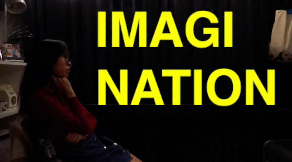
After watching The Royal Tenenbaums by Wes Anderson, I was immediately inspired by his use of words combined with his aesthetics. I noticed that his use of the futura font is one of the key features of his ‘style’, that anyone who sees the futura font + his color scheme would immediately think “Oh! Duh! Wes Anderson!”

This is the effect I want to achieve.
And so, I started to test out different scenes to emulate Wes Anderson’s style of wording. Instead of the futura font I used Helvetica. I used the color yellow to make the words pop out.


However for some of the scenes I also used blue, red and green to create contrast and to make the words pop out more.


Comments